
 |
|
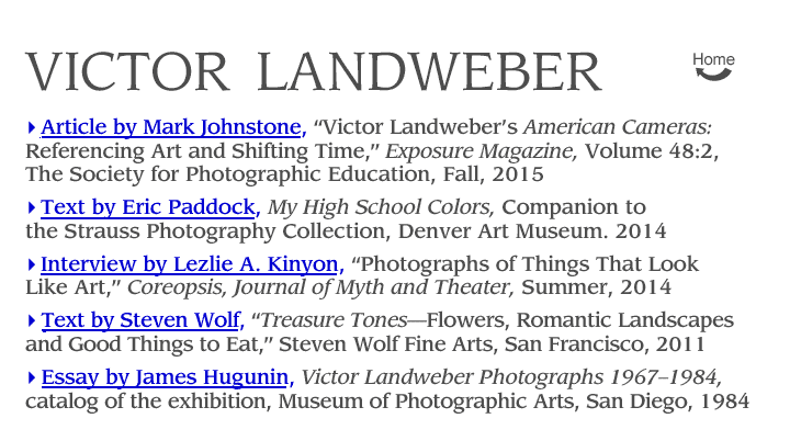
| Hopalong Cassidy, 1983 |
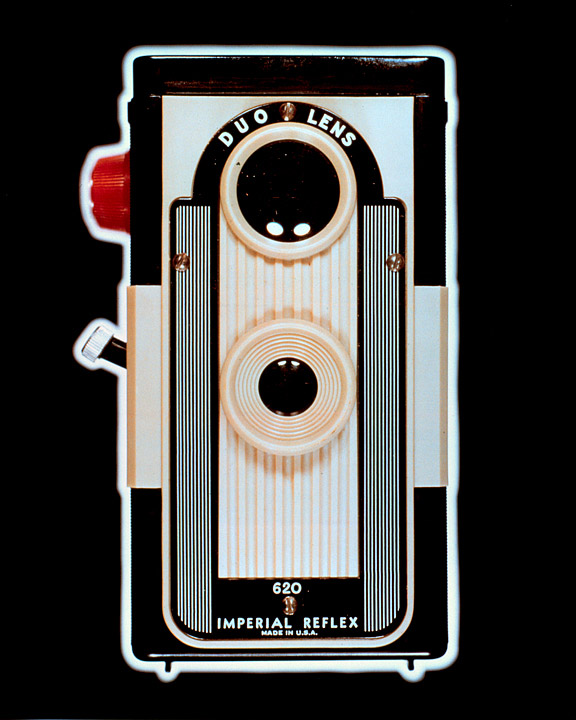
The fifteen photographs in the set are titled with the model names of the cameras, evoking sly references to movies, implications of social status and a variety of marketing hyperboles: Brownie Starlet, Hopalong Cassidy, Lady Carefree, Ansco Panda, Bear Photo Special, Imperial Debonair, Duo Lens Imperial Reflex, Tri-Vision, Capitol “120,” Cubex IV, Spartus Press Flash, Boy Scouts of America Official 3-way Camera, Beacon Two-twenty five, Ansco Shur Flash and Instaflash. Underlying these photographs and their titles is a subtext about 1950s American manufacturing and dynamic marketing, nostalgic pleasure and, most significantly, photography itself. American Cameras underscores what Siegried Kracauer wrote when he said: “the real subject of photography is photography.”(2) Landweber’s cameras are a prime example of photography turned back upon itself, its tools and, by implication, its methods.
A camera is inconsequential as an art object, but these photographs transform their subjects into revered objects. Landweber’s seemingly innocent cameras are made to glow with hyperreal intensity. The Beacon Two-twenty five beckons as would an actual beacon. The Brownie Starlet becomes a star in its own right. They celebrate a mid-twentieth-century moment in middle-class American life when photography had become such an ordinary activity that cameras were fashioned as stylish accessories. As art historian and theorist James Hugunin has acutely observed:
Landweber considers this series a critique of the American market place, its products and promotions. Hence his slick rendering, a conscious borrowing from the conventions of advertising photography. Quoting the look of commercial photographic illustration, he slyly comments on how photography can enhance the mundane, arouse one’s desire to possess the object pictured, even when the image of the promotion is a far cry from the reality of the product.(3)
 |
|
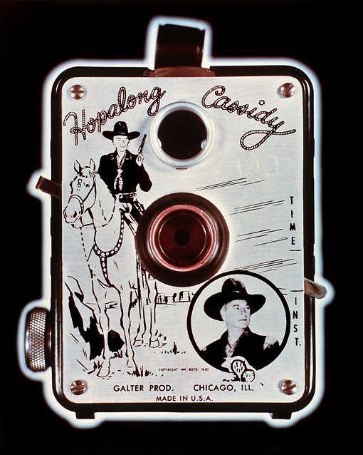
| Brownie Starlet, 1983 |
Landweber’s treatment of the cameras parallels the manufacturer’s original marketing ploy with a presentation that promotes desire: large glossy prints (which were as much a luxury in the 1980s as in the 1950s) taking advantage of Cibachrome’s deep blacks and silvery highlights to which he adds glowing halos and a dash of red. His pre-digital, pre-Photoshop method involved hand-made masks, backlighting and multiple exposures. He explains:
I wanted to separate the cameras from the black background and came up with a technique for rimming them with light. I cut a black-paper mask a little larger than the outline of the camera and positioned the camera and the mask together on a light box, such as one used for viewing slides. I made the mask by positioning a photographic enlarger at the same height as my camera lens and printing a photogram of the camera. I then sandwiched the photogram with a piece of black velour paper and cut out a slightly larger shape than the image of the camera. I placed the black paper mask and the camera together on the light box and gave two exposures: one for the camera which was front illuminated, and one for the light coming through the mask which let me stop down the lens and filter the color of the glowing outline for the best effect. As one indicator of how photography has been transformed by several decades of digital photography, it’s now so easy to produce an “outer glow” in Photoshop, that the possibility has become routine. (4)
There are three time periods referenced in this essay: the first is roughly the decade of the 1950s when most of these cameras were made; the second is the early 80s when Landweber created the images; and the third is our present time and the publication of this text in 2015.
I grew up In the 1950s and early 60s with black-and-white television, roller skate keys, hula hoops, a black Schwinn bike with fat tires that I rode everywhere, and a Brownie camera. Landweber and I, as kids growing up in the Midwest, would have shared a cultural context. He was from Iowa and I from Missouri, and both our fathers were in the sciences. He got his first camera at twelve and, as he is a bit older than me, I was given my Brownie at about the same time period, on my seventh birthday. He photographed a collection of sea shells using a close-up lens, and I posed my dog Pal around the house.
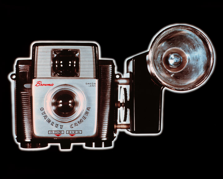
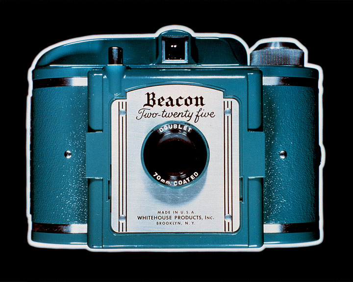
| Beacon Two-twenty-five, 1983 |
I have several cameras like these in my personal “cabinet of wonders,” along with several empty cans of Dektol and other outdated photographic ephemera. An empty D76 developer can holds my pencils and pens next to the computer keyboard on which I am typing this essay, and nearby a huge HP Designjet printer is nestled against the wall. Slightly behind that is a poster announcing a schedule of twelve exhibitions of Landweber’s American Cameras, which travelled 1987-89.
 |
|
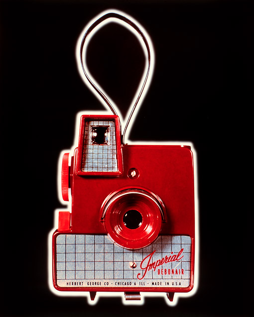
| Imperial Debonair, 1983 |
I first saw Landweber’s photographs of cameras in 1984. I was mesmerized by them. They were stunning, commercial-like, but not commercial, immaculate glowing icons. I knew then that I liked them, but it has taken me thirty years to fit them into the context of what has gone on in photography and art since then. American Cameras emanates directly from the art and artists that Landweber saw, thought about and encountered while living in Los Angeles in the 1970s. Other artists and photographers were incorporating photography into works that broached ideas about a larger world of art: Robert Rauschenberg’s Combines, Robert Fichter’s exploration of image-making and printing possibilities, Ed Ruscha’s and Wallace Berman’s merger of Pop imagery and photography, John Baldessari’s fusion of concept and form. Landweber, whose projects span a broad range of art-world references says, “If anyone inspired me to think that a photographer could work both diversely and coherently, it was Robert Heinecken.”(5)
Today, these images twist and turn in the face of personal remembrances as well as social, cultural and photographic references. I can only imagine what someone born in 1983, who now is in their thirties and fully invested in digital photography, would think of them. For Landweber at that age, it would have been to recall photographs from the 1920s. To remember a vision of life in the 1950s is to reclaim the past, so odd and distant from today. To fully appreciate American Cameras, it’s worth remembering or learning about how life was lived then and how ordinary people made photographs before the wide-spread popularity of automatic digital cameras. Landweber’s beautifully rendered images, anachronisms and eye-candy nuggets, can connect viewers to a place and time that mutates from the 1950s to the early 1980s to now.
 |
|
| Tri-Vision, 1983 |
Mark Johnstone is an author, curator, educator and public art advocate. He has authored: essays for over 50 books and catalogs; more than 350 for periodicals; and been the curator of over 80 exhibitions at galleries and museums in the US, Europe and Japan. While living in Los Angeles (1977-2004) he administered the Public Art Program for the City of Los Angeles, and was Vice-President and Exhibitions Curator for Security Pacific Corporation. His writings are in special collections at Colorado College and the Center for Creative Photography.
The Society for Photographic Education,
Fall 2015 (Volume 48:2)
(2) The Kracauer quote is from his book “Theory of Film.” The particular chapter was reproduced in Volume two of “The Camera Viewed,” edited by Petruck. Both are gone from my library.
(3) Hugunin, James, essay in Victor Landweber Photographs, 1967–84, Museum of Photographic Arts San Diego, page 19
(4) Landweber, Victor, from email correspondence with the author, 11/11/2014
(5) Landweber, Victor, phone conversation with the author, 2/26/2015

 |
|
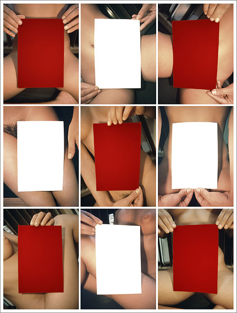
| My High School Colors, 1976/2011 |
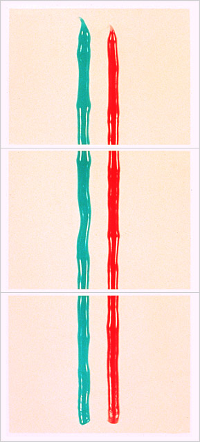
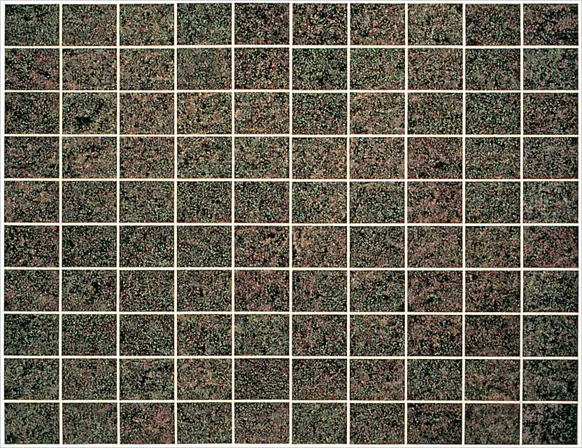
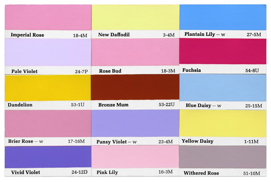
My High School Colors is from the series Cherie Holding Colored Cards. For that project Landweber asked the model to hold selected 6×9 inch Color-aid cards against her nude body. She positioned the cards at her own discretion, and then—regardless of the angle at which Cherie was holding them—Landweber placed his camera so that the edges of the cards aligned with the edges of his photographs and filled approximately the same proportion of each frame. He selected nine or sixteen vertical photographs of each color and arranged them in grids for exhibition.
My High School Colors demonstrates that rigidly conceptual photographs are hardly without visual interest. The red and white cards shimmer and bounce as one’s eye scans the grid, and the interweaving body parts where the photographs meet form patterns as complex and formally lively as any geometric weaving.
Companion to the Strauss Photography Collection
ISBN 978-0-914738-94-7, Denver Art Museum, 2014

 |
|
| Untitled (stump), (2009 |
VL:
LK:
VL:
LK:
VL:
LK:
VL:
LK:
VL:
LK:
VL:
LK:
VL:
LK:
VL:
LK:
VL:
 |
|
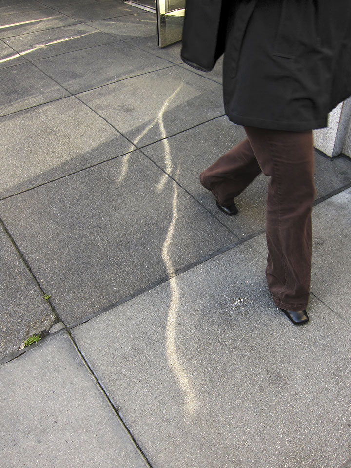
| Untitled, 2011 | |
Some other
pictures
in this portfolio: the
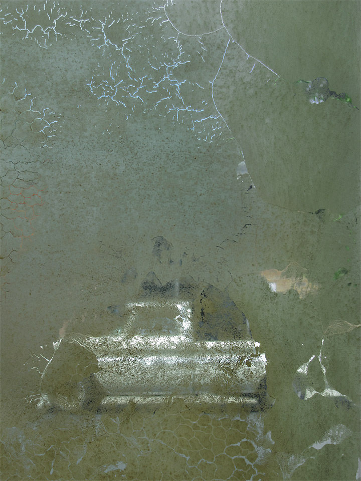
one of the truck, photographed through a window, that seems infused
with electricity—I think of it as being about desire for a coveted
object. The
one of the streak of light on the sidewalk is particularly magical.
It’s as if the light had fallen out of the sleeve of the mysterious
passer-by and landed on the pavement where little sparkles have become
stuck.
LK:![]() I
think that more than many of the other arts, photography is very
good at pointing out the beauty of the ordinary.
I
think that more than many of the other arts, photography is very
good at pointing out the beauty of the ordinary.
VL:![]() Well,
we’re all photographers these days. “Artworks” is
very much about pointing out the possibility of making
something extraordinary out of ordinary
experience.
It indicates the potential of a certain way of thinking
about the process of making photographs.
Well,
we’re all photographers these days. “Artworks” is
very much about pointing out the possibility of making
something extraordinary out of ordinary
experience.
It indicates the potential of a certain way of thinking
about the process of making photographs.
LK:![]() “The
process of making photographs”—we don’t
use darkrooms anymore. Tell me about your process.
“The
process of making photographs”—we don’t
use darkrooms anymore. Tell me about your process.
VL:![]() It’s
digital. It’s in color. The photographs are made
with a small camera that I carry all the time, mostly used
at the wide end of the zoom range. I’m very particular
about my subjects and can go weeks without photographing.
I use Photoshop as I used to use a darkroom though with
far greater flexibility and control. I make my prints using
a large inkjet printer. I make a lot of trial prints before
I’m satisfied enough to print a small edition. Prints
are 18"x24", made with stable inks on glossy
paper.
It’s
digital. It’s in color. The photographs are made
with a small camera that I carry all the time, mostly used
at the wide end of the zoom range. I’m very particular
about my subjects and can go weeks without photographing.
I use Photoshop as I used to use a darkroom though with
far greater flexibility and control. I make my prints using
a large inkjet printer. I make a lot of trial prints before
I’m satisfied enough to print a small edition. Prints
are 18"x24", made with stable inks on glossy
paper.
LK:![]() Do
you have any final words that you would like to say
to all of us out here in the world doing our art?
Do
you have any final words that you would like to say
to all of us out here in the world doing our art?
VL:![]() No.
I do not have final words. I’m engaged in a process,
and so there is no destination and no finality. It’s
about continuing to engage in the process.
No.
I do not have final words. I’m engaged in a process,
and so there is no destination and no finality. It’s
about continuing to engage in the process.
LK:![]() Well
that’s something in and of itself.
Well
that’s something in and of itself.

 |
|
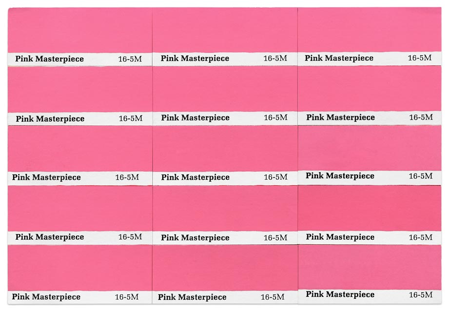
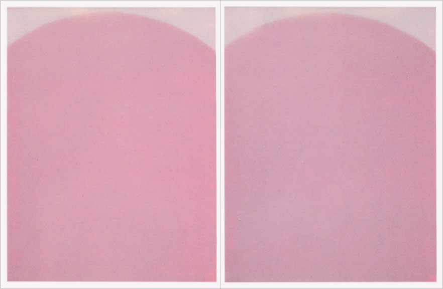
| Pink Masterpiece, 1975/1984/2009 |
Landweber’s original photographs were 3¼"×4¼" Polaroids whose lapidarian intensity evoked the work of Agnes Martin if Agnes Martin had filled up her art with the world instead of emptying it out. Thirty-six years later, Landweber now uses digital scanning technology and sophisticated digital printing methods to make his photographs look the way he had always wanted them to look—bigger, richer, more intense, and at a scale where they can successfully bridge photography, collage and painting. The paint chips appear to float against large beds of white, rising up against flat, blank backgrounds, emphasizing the subtlety and comic intent of Landweber’s palette. At the same time their sentimental, quasi-poetic themes cloak a mischievous desire to muck up the Apollonian boundaries of the world.

 |
|
| Victor Landweber Photographs 1967–1984. catalog of the exhibition, Museum of Photographic Arts, San Diego, CA, 1984 | |
Victor Landweber, in nearly twenty prolific years of photographic work, has been one of a handful of serious photographers to value invention and discovery over redundant consistency. His interests have ranged from ironic social commentary to process-oriented photography to conceptual work in the vein of photography-about-photography. His art has viewed the products of mass consumption: pills, health drinks, and candy. He has created landscape vistas from hardware-store paint samples, photographed his high school colors as red-and-white cards held before a model’s nude body, and adopted several strategies for emptying his photographs of content—for example, making a set of image-less Polaroids which were not shot in the camera but only exposed or not exposed to light. And recently, he has aimed his camera at the plastic faces of American box cameras, making large, two-dimensional color “portraits” of the very machinery of image-making itself.
Each of Landweber’s ideas is expressed in a sort of mini-body of work, self-contained, achieving its own closure. Yet an overview reveals a persistent obsession that has sustained this artist’s fascination with photography: a critique of representation—images that turn representation back on itself so that its authority in our lives may be challenged. Landweber’s work takes apart the language of the photograph in a manner that displays the sutures in the simulacrum, stitches that traditional photographic representation (rooted in a classical way of beholding and possessing the world) attempts to cosmeticize in order to gain as much representational transparency as possible. Such transparency is usually achieved through art’s conventional strategies: one-point perspective, for example, or the concealment of a picture’s surface and the suppression of all reference in an image to the artist and the viewer, as well as to the actual situation of the art’s making. In contradistinction, Victor Landweber’s visual strategy is aimed at foregrounding the very basis of photographic representation. Thus, unlike Ansel Adams or Minor White, Landweber is as much concerned with what representation conceals as with what it reveals. Often employing witty, ironic social commentary, he re-examines the syntax of photographic representation, fabricating disruptions of the photograph’s seemingly natural rendering, not unlike Bertolt Brecht’s attack on the seamless narrative of traditional Western drama.
The camera can only describe surfaces. It scrutinizes the world as if its exterior appearance is all that exists and then turns that surface into yet another surface, that of the photographic print. Landweber consistently exploits this flattening of space, his photographs taking us by surprise as real space is unexpectedly transformed into something not quite so recognizable. His photographs may bring an image right up against the surface of a print, like a child pressing his face against a window glass, or suggest the view from a high-flying jet, even though the real distance may be only inches. Such defamiliarization of the everyday world points out the degree to which we have become comfortable with our self-constructed reality, complacent with our arbitrary truths, suggesting that other, less familiar ways of viewing the world might provide surprising, beneficial insights.
Many photographers, particularly landscapists, strive for a sense of dynamic vastness in their pictures. Majestic forms, atmospheric distance, the revelations of light, and carefully chosen tonal values combine into a sublime reverie. But Landweber makes other use of these devices. Turning the elements of image-making back on themselves, he points at the processes of life and art, undercutting the sublime, bringing formal and technical virtuosity to bear on an ironic interpretation of the objects and events before his camera.
 |
| Live from the Moon, 1972/1974 |
Victor Landweber’s photographs are about a world of contrivance, of fabricated objects and events. How appropriate, then, his Hollywood environs, where he daily travels among the faded glamour of might-have-been screen idols and the always newly arriving hopefuls ready to sacrifice themselves at the altar of media stardom. Delighted with the masquerade, he is active within the fluid metaphysic of illusion in which the real and the fabricated are blended, like the components of an exotic cocktail, into a new brew, the hyperreal. Improving upon this heady mixture, he combines his technical virtuosity with a dash of social comment. Drawing from the tension between the beauty and organization of the ideal and the chaos and random encounters thrown up by mundane existence, he devises unexpected layerings of flavor—complex, invented meanings. Sometimes directing, othertimes simply recording, Landweber’s photographic vision critiques the authoritative believability of representation while laying bare the false fronts of our cultural productions.
![]()
 |
|
| El Paso, Texas, 1967 |
As culture-bound
beings, inextricably caught up in our own creations, our uncertain
relationship with our self-invented world is represented in Landweber’s
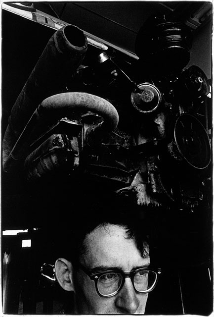
early social landscape photographs. As for instance, in El
Paso TX (1967), an image of a man’s head merges
with an internal combustion engine. The fusion is startling, surreal.
In another
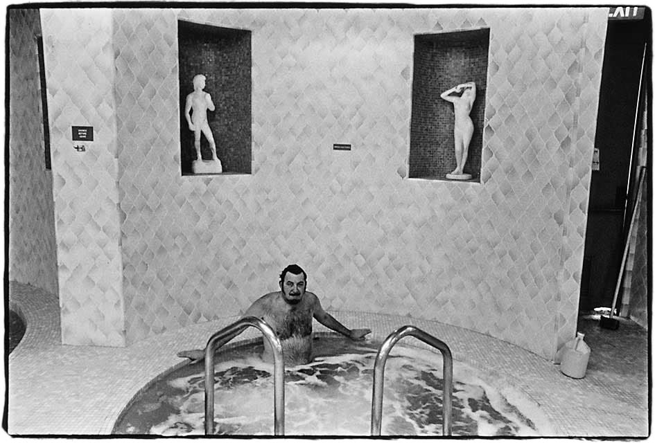
print, Jack
Lalanne’s European Health Spa, Torrance CA (1970),
a large, hirsute man is shown in a jacuzzi, its environs decorated with
classical sculptural miniatures about which a background of janitorial
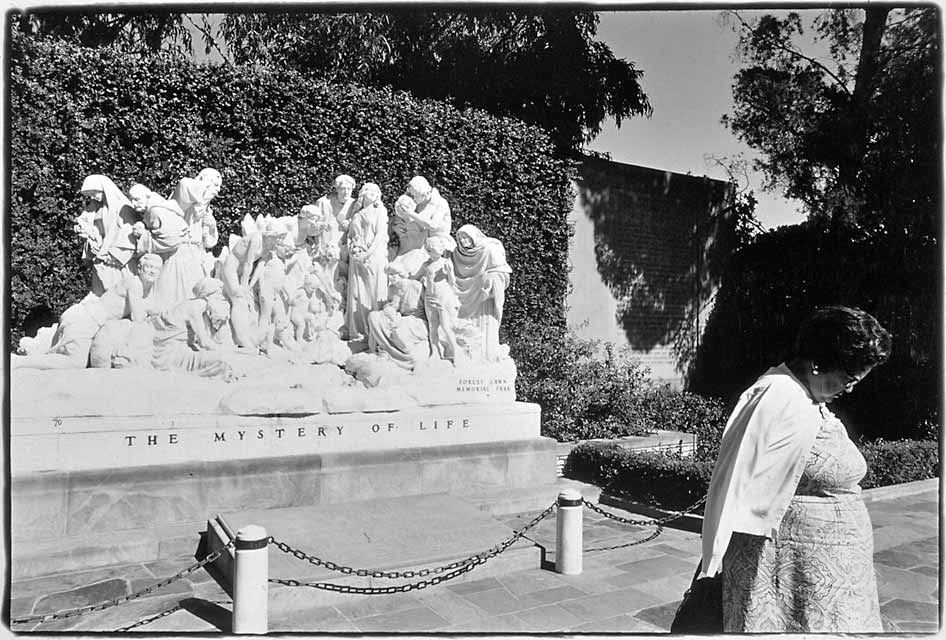
supplies comments ironically. In Forest
Lawn Memorial Gardens, Glendale CA (1971), a corpulent
woman turns away from the ersatz uplift of a sculptural tableau labelled “The
Mystery of Life,” her posture making her seem as if resigned to betrayal
by life’s mystery. For Landweber’s picture integrates the woman
and sculpture into another, more complex tableau: the fabricated reality
of the photograph. Life’s existential mystery has been augmented
by the no less problematic mystery of representation.
True to his name, Landweber’s recurrent motifs have included
not only social, but natural landscape as well—both bent to serve his
idiosyncratic vision. Like his social landscape images of uneasy cultural accommodation,
his natural landscapes reflect our culture’s anxious relationship with
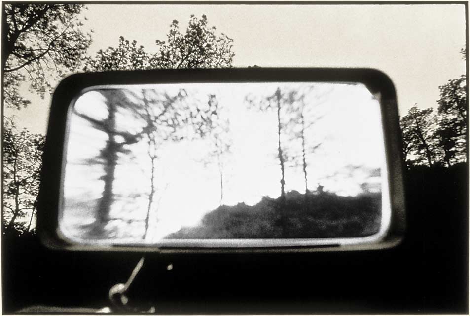
its surroundings. In one forest scene, a
magnifying lens has been held before the camera as if the camera,
an extension of our eyes, needed some additional optical attachment. The exaggerated,
distorted image that results undercuts any utility obtained with the device.
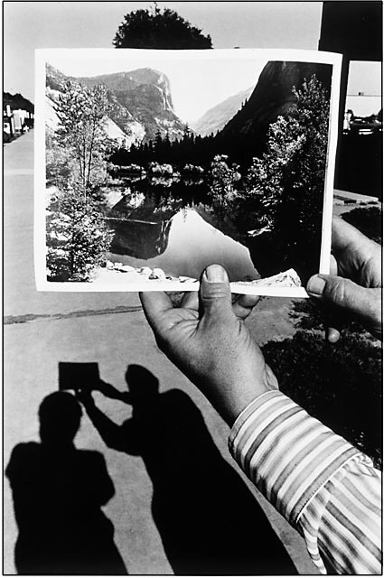
In another image, an Ansel
Adams Yosemite print is held before, almost merging with, an urban scene.
Natural vista and man-made reality nearly, but not quite, fuse in the optical
space of the photograph. In another picture from this period, toy geese and
a miniature moose are made seemingly real participants in a roadside scene
by being stuck onto a piece of window glass interjected between the camera
and a meandering road cut through the mountains above Malibu.
Landweber’s interjections—pictures of pictures, objects inserted
in-frame—underscore the camera’s transformation of the fleshy,
three-dimensional world in which we live into a flattened ghost where pictorial
space is an ideal construct. Here, cultural artifact and natural fact are,
with a click, joined together. Our appreciation of nature is made a synthetic
conceit while nature herself appears in retreat before our pitiful intrusions.
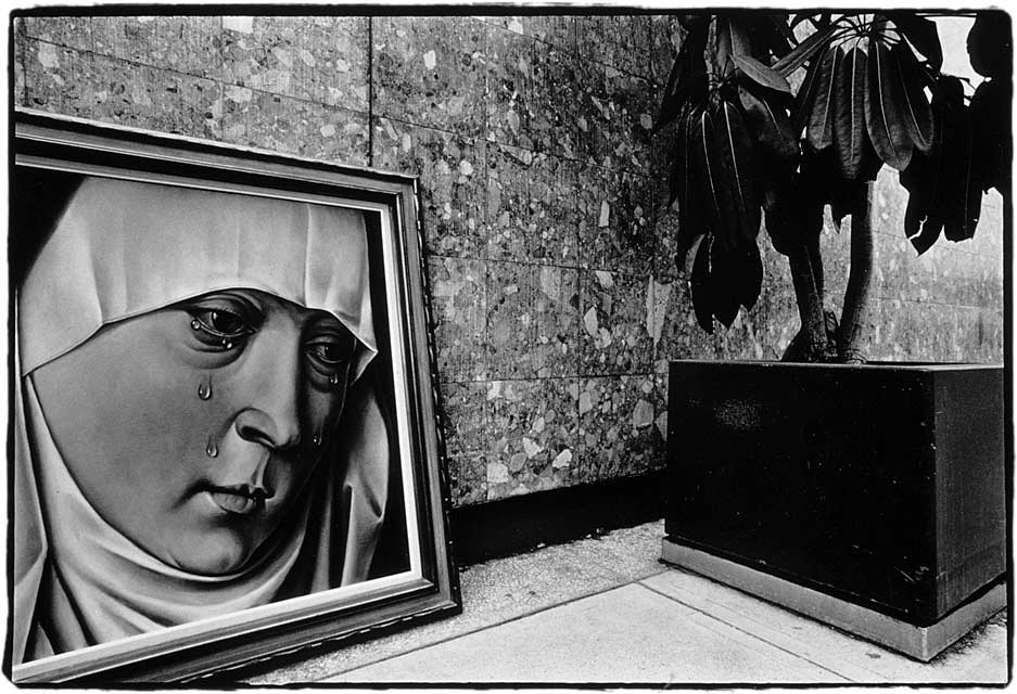
In one photograph, taken at an art fair, Landweber juxtaposes
a black-velvet painting of a weeping Madonna with a potted rubber plant.
The sorrowful Madonna seems to shed her tears over their common fate as mere
simulacra, she as a painted idealization, the potted plant as a domesticated
stand-in for the natural existence we’ve largely abandoned.
![]()
 |
|
| Los Angeles, 1972 |
Wanting
to uncover the essential form underlying photographic representation,
Landweber began to solarize and bleach his prints in late 1972. The idea
was to reduce content to secondary importance, offering primacy instead
to the relief-like appearance of the solarized print. In these pieces,
the integrity of the straight print’s surface has been photo-chemically
torn and scarred. Human forms look flat, while flat forms such as walls
take on volume. Landweber’s laboratory processes layer another
set of distortions on top of those already inherent in framing and vantage-point
and in addition to those of exposure, development and printing as are
required
for more familiar forms of photographic reproduction.
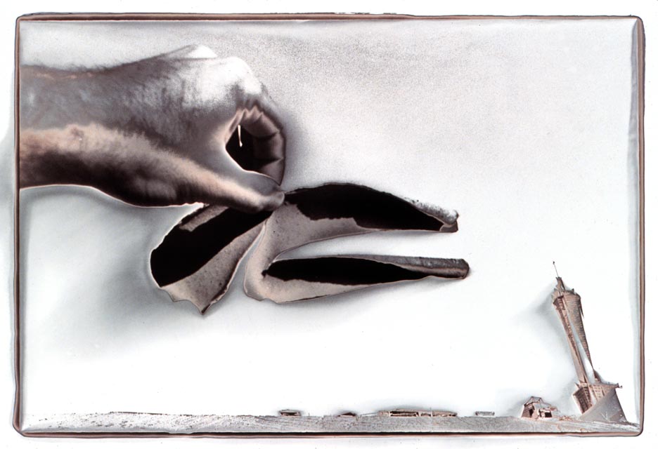
In one untitled print from this series, a
hand appears to be tearing a wound in the sky as if it werea mere
paper backdrop. At the horizon is seen a leaning, miniature, futuristic tower.
Solarization heightens the experience of estrangement, suggesting disruption
and disillusionment. Here, in one picture, is Landweber’s deconstruction
of traditional photographic representation combined with a metaphor for the
existential deconstruction of man’s comfortable, rational world and
the unknowable abyss that gapes open in its place.
 |
|
| Aim and Closeup, 1976 |
Landweber’s research into photographic reproduction demonstrates the futility of photographic abstraction. For, unlike hand-crafted mediums, photography’s audience always demands, “What is it?” and reserves its judgement until it has an answer. With these pictures, Landweber has moved significantly away from our usual understanding of photography, for at what he aims his camera matters less than how he aims it. Merely seeing what V-8 Cocktail Vegetable Juice looks like tells us very little beyond what we already know, but how it is seen tells us about the nature of photographic representation.
-1976.jpg)
 |
|
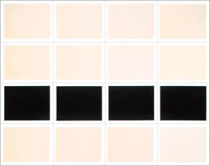
| Two Packs of Polaroid, 1976 |
In approaching abstraction, Landweber sought to minimize content by devising an all-over sameness of color and texture and by the repetition of elements, whether numerous pills within a single frame or several prints working together as modules of one large piece. In Two Packs of Polaroid (1976), he pushes such minimization all the way. Working with the binary logic of on/off, Polaroids are either exposed, producing all white prints, or are left unexposed, resulting in prints that are totally black. Two sixteen-print grids, one all black, the other all white, are thus generated. Only here, Landweber’s use of a title to reconcile the abstraction identifies no external reality but the process itself, for the images represent nothing but the very system of their production. As it is by degrees of black and white that all values of the grey scale are produced, this conceptual work addresses the primary opposition from which continuous-tone imagery derives—just as voiced sounds (phonemes) are the basis for spoken language. In Two Packs, Landweber achieves his most reductive example of photography-about-photography.
 |
|
| Flower Garden, 1976/2010 |
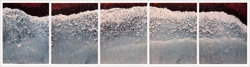
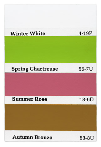
Painters have often made paintings from photographs, but in Treasure Tones (1975), Landweber makes photographs about paint. Thinking in terms of the evocative qualities of color, he began to collect paint samples to photograph. The resulting prints are titled after pictorial scenes suggested by his samples’ color names. Thus an arrangement of colors labelled “winter white, spring chartreuse, summer rose, and autumn bronze” becomes The Four Seasons; 15 colors with names of flowers become Flower Garden. Landweber’s titles suggest the excessive sentimentality of camera-club pictorialism, yet his rigid layout in straight lines and grids denies any such sentiment. Each array of paint samples remains only a schematic from which the viewer’s imagination must create its own mental picture derived from memory or fancy, with as many such mental fabrications as there are viewers. In Treasure Tones, Landweber has equated landscape with mindscape, producing that bridge between material reality and idea which photographers Alfred Stieglitz and Minor White termed an “equivalent.” However, this equivalent is not a product of the photographer’s ability to pre-visualize the final image prior to exposure (such as was practiced by White and Ansel Adams), but rather the result of a post-visualization on the part of the viewer whose imagination “develops” the “latent image” of the paint samples into a complete, albeit subjective, scene.
![]()
 |
|
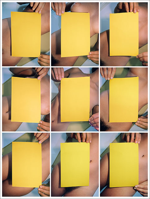
| Cherie's Favorite Color, 1976 /2010 |
Formal ploy usurps erotic display in Landweber’s photographs of a nude woman holding colored cards (1976–78). Expanding on his color swatch idea, he here initiates his return to images with spatial depth. He plays with our innate voyeurism as traditional content priorities are reversed: a female nude (normally the subject) becomes a background for colored cards (like a normal backdrop) which the model holds before her. Single prints are grouped into nine-print grids so that the effect is predominantly one of color, with patches of female flesh peeking out from behind the cards—yellow ones in Cherie’s Favorite Color and reds and whites in My High School Colors. Effectively censoring the nude, the cards create formal tensions between presence/absence and illusory depth/flatness. But this was not the first time that Landweber had opened up a flat rectangular space in the picture plane. Earlier, around 1974, in a set of black-and-white photographs, he explored the formal possibilities of using a white card or rectangular area of bright light within the image. Being the same white as the border of the print, these toneless areas at first appear physically cut from the print itself—negative spaces asserting the sheer materiality of the photograph. They frustrate our reading of the picture as a window onto a real scene, while the white areas themselves suggest windows waiting for scenes to appear within, or mirrors catching the brightness of a blank sky, reflecting nothing but light itself.
 |
|
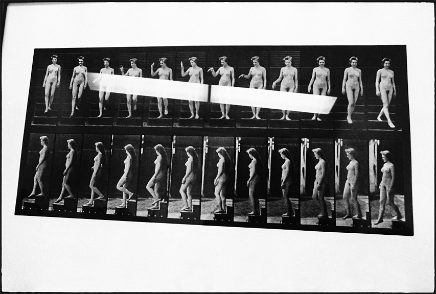
| Muybridge Nude Descending a Staircase, 1974 |
In the case of his Muybridge Nude Descending a Staircase (1974), Landweber re-photographed a classic 19th Century motion study by Eadweard Muybridge. In Landweber’s version, a nude demurely reveals herself as she descends from behind a trapezoid of light cast on the print by the reflection of a fluorescent ceiling fixture. A reproduction of an old master work would normally be credited as the work of the master, but this photograph is clearly something different. The reflection of the light fixture, the camera’s distortion of the rectilinearity of the original Muybridge, reveal the visual syntax of the photographic process itself. Combining elements of art and happenstance, Landweber’s photograph pays homage to Muybridge, its title to Marcel Duchamp and Duchamp’s famous descending nude. As Muybridge invented a way to analyze motion with photographs, so Duchamp interpreted a photographic idea when synthesizing movement in cubist painting. Landweber’s photograph aligns these related concepts, suggesting the complex interplay of contemporary ideas and the histories of art and photography.
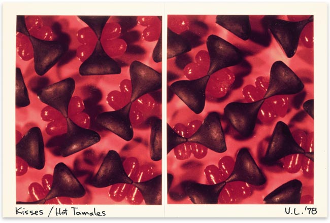 |
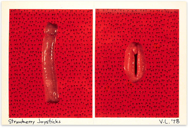
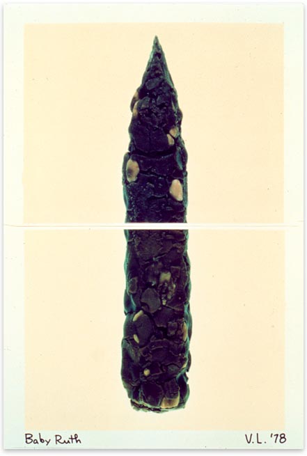
In 1978, Landweber returned to photographing on his copy stand, producing a
playful series of images of candy. Chocolate bars, chewing gum, animal crackers,
and cough drops were photographed life-size on pairs of Polacolor prints, each
containing a portion of the whole subject. The implied eroticism of sweets
is suggested by the genital imagery of Strawberry
Joysticks and Kisses/Hot
Tamales, while a scatological association is humorously offered
in Baby
Ruth, where a candy bar takes on the appearance of human feces.
Thus candy bar/feces becomes an object of both ingestion and elimination, setting
up the opposing reactions of attraction and repulsion.
Beginning in 1976 and continuing into 1981, Landweber returned to the
streets to continue his social landscape work. His earlier social landscapes
had been
in black and white, but now he could exercise his newly acquired experience
with color. Viewing such work as an integration of his earlier research,
he delighted in the interplay of hue, shape, images-within-images, and
jarring
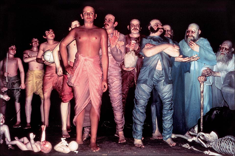
juxtapositions. In Festival
of the Chariots, Venice, CA (1977),
he photographed a display in a tent during the annual Hari Krishna festival.
Brightly
dressed mannikins, intended to be selectively spotlighted to illustrate “the
stages of life,” have Western faces but wear Eastern clothing.
At their feet lie the bodies of innocent children (baby dolls) and a
human skeleton.
This might be an obscure moment in Krishna mythology, for Landweber’s
manner of photographing—the flash of his strobe spoiling the exhibition
designer’s lighting scheme—makes the scene come to life,
as if the photographer had arrested a decisive moment in some strange
ritual. The
camera’s usual tendency to turn reality into a “flat death” has
been reversed, the strobe’s lightning imparting, Frankenstein-like,
life to the non-living.
 |
|
| Museum of Naturasl History, Los Angeles, 1977 |
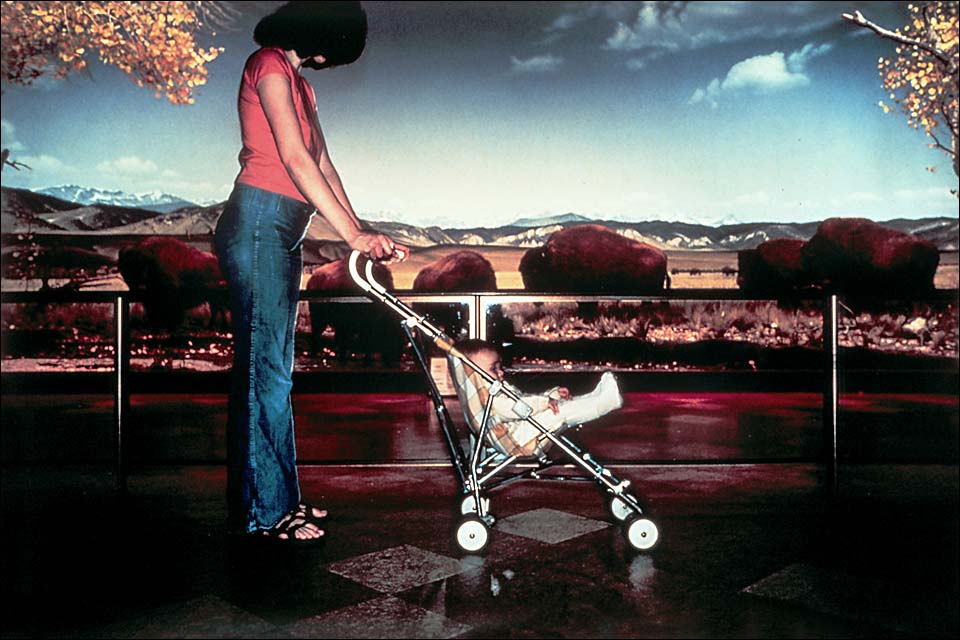
A different sort of juxtaposition of living and non-living, Natural History Museum, Los Angeles, CA (1977), pictures a mother pushing her pram and baby past a herd of grazing bison in a picturesque setting from the Old West. Several readings might be possible: 1) the woman, child and bison are all real; 2) they are mute dummies set up in a real landscape; 3) they are mannikins set before a painted backdrop; 4) the woman and child are fake, but the bison are actually grazing behind; 5) the mother and child are real, but the bison are stuffed animals posed in front of a painted backdrop. Actually, the mother and child were museum visitors walking past a trompe l’oeil diorama, but again Landweber’s way of photographing has turned living flesh into mere images while stuffing and paint seem real. Of course, once photographed, both real and fake co-exist on the same plane of miniaturization the photographic print. Actual and virtual are equally real and unreal after optical projection onto light-sensitive paper, so that one’s effort to find out which entities in the image are really real involves us in a category mistake like the one made by early film-goers who panicked when they saw a high-balling train coming straight at them from the screen.
 |
|
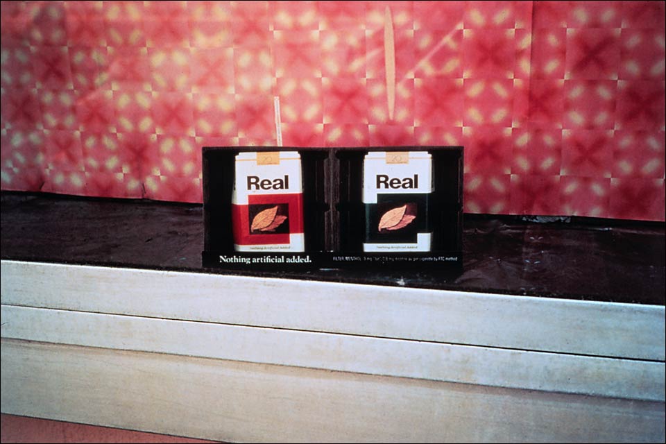
| Rudolph Rx, Los Angeles, 1977 |
An ironic commentary on the relationship between the real and the artificial is the topic of another picture for which Landweber has photographed an advertisement for Real cigarettes. Two packs of Real, each bearing a photographic reproduction of tobacco leaves, occupy the center of a display window. Underneath one pack, the manufacturer proudly states its claim: “Nothing artificial added.” However, the free-standing display has as its backdrop a wall of glowingly fake tile, besides being an artifice artificialized through Landweber’s re-photograph of the advertisement. Here we have a visual-verbal conundrum akin to that famous painting by Rene Magritte, This is not a Pipe (1926), where the artist has painted a pipe and written underneath: “Ceci n’est pas une pipe.” Like Magritte’s Surrealist painting, Landweber’s photograph exemplifies the penetration of language into the form of things, revealing the ambiguous power of discourse to deny and redouble. Magritte himself has said: “Between words and objects one can create new relations and specify characteristics of language and objects generally ignored in everyday life.” And, “Sometimes the name of an object takes the place of an image. A word can take the place of an object in reality. An image can take the place of a word in a proposition.” We’ve seen such substitutions in Landweber’s Treasure Tones paint swatches, another example of the interplay of language and image in this photographer’s work.
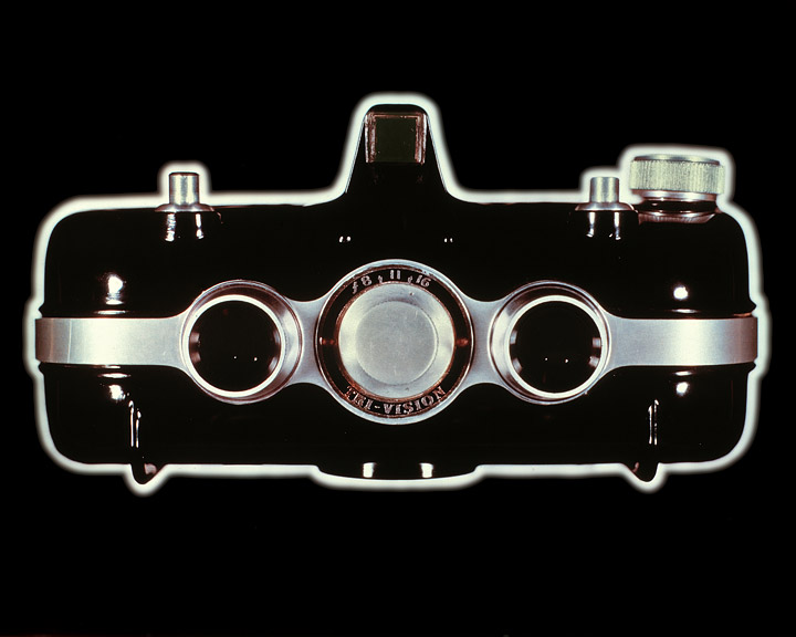
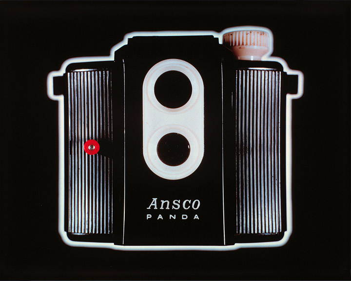
| Beacon Two-twenty-five, 1983 |
In a quintessential example of his strategy of turning representation back
on itself, Landweber has made photographic apparatus the subject of his most
recent photographs, American Cameras. Seemingly portraits for which
a camera has sat for the camera, the photographer has chosen his subjects for
their unusual names and photogenic faces. The Duo
Lens Imperial Reflex, Beacon Two-Twenty
Five, and Ansco Panda offer their
best expressions to Landweber’s own camera (which he assures
us is the also-American Graflex XL). Plastic box cameras, manufactured
during
the
1940s and 50s to
satisfy
the visual acquisitiveness of the prospering middle class, here enlarged
to 16-by-20 inches, achieve the status of celebrities. Each is separated
from
its background by a glowing halo, appearing a spectacular apparition,
suggesting an exalted specialness, though belying the marginal utility
of these simplest
of cameras. An apparent mania for product differentiation among their
manufacturers has made each camera a pastiche of art deco design
and eye-catching gimcrackery,
masking the underlying similarities among such sub-basic photographic
apparatus.
Landweber considers this series a critique of the American market
place, its products and promotions. Hence his slick rendering,
a conscious borrowing from
the conventions of advertising photography. Quoting the look of commercial
photographic illustration, he slyly comments on how photography can
enhance the mundane, arouse one’s desire to possess the object
pictured, even when the image of the promotion is a far cry from
the reality of the product.
As Landweber notes concerning his subjects, “During the 1940s
and 50s, while cameras of German and Japanese manufacture brought
new ease and versatility
to photography, the American photographic industry found its best
shot at domestic competition to be a baroque elaboration of the non-adjustable
camera in which
style was substituted for function and glib packaging became the
principal consumer draw. These cameras, incapable of any but the
simplest modes of operation,
offering little to the photographer’s real needs, were, like
many American goods, designed more to be sold than to be used.”
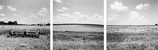 |
| Pocahantas to Le Mars, 1976/1984 |
These landscapes acknowledge the transformation of American soil into real estate, just another article of commerce, for Landweber has used his images of the land exactly as he had his images of product surfaces like Rustoleum, toothpaste, and V-8 juice. These earlier images had taken on the characteristics of landscape; now these actual landscapes seem as if part of the panoply of American expendables. Common to both series is the fact that these photographs are not just pictures per se, but part of a total concept in which the act of photographing is just as significant as the visual content to the meaning of the work. How the photographer has construed the strategy of his image-making has become the most important parameter of his completed works.
![]()
 |
|
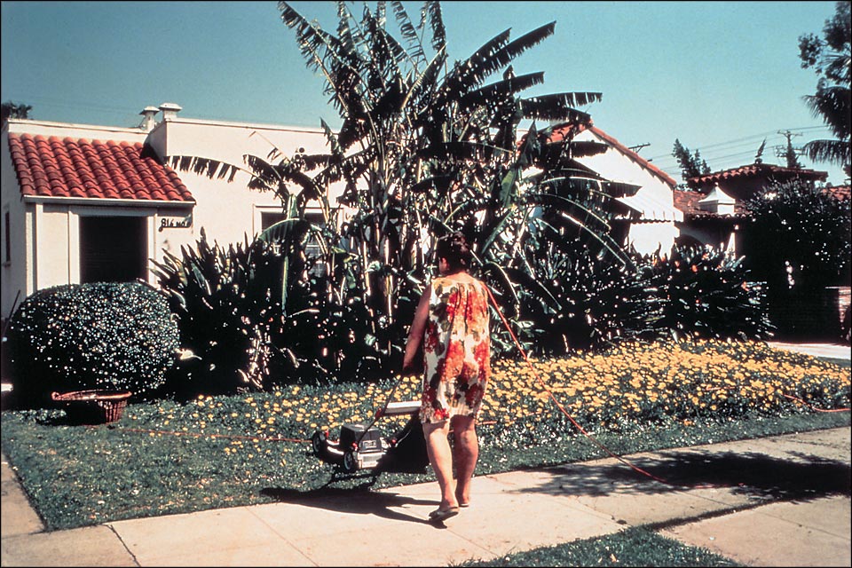
| Crescent Heights Blvd, Los Angeles, 1980 |
In scanning
nearly twenty years of Victor Landweber’s photographic production,
we’ve seen him oscillate between works which act as purely formal research
and works which integrate his formal discoveries with ironic social commentary.
He will play with how the camera reduces everything to the hyperreality of
a photographic print, then use the ploys of photographic form to comment upon
how our own social reality is tending toward the hyperreal—where the
real and the simulated merge into each other, allowing little discernable
distinction between them. His photograph, Crescent Heights Blvd., Los Angeles, CA (1980)
makes the point. A woman is power-mowing a yard planted with daisies; we
see her from behind, just as she is stepping off the sidewalk, mowing in
the direction
of her house, a typical California Spanish stucco. She is wearing a floral-print
mu-mu that blends in with the flowers. Sky, lighting, the placement of the
woman, conspire to make it appear that she is part of a diorama in some museum
located in our distant future in which onlookers can see how people lived
in the 20th Century. Yet, unlike a great many of Landweber’s fictions, everything
in the photograph is “real.” The image is unsettling as it hints
again at the collapse of discernable differences between the real and the
artificial.
Herein lies Landweber’s persistent obsession: the blending of representation
and re-representation within the hyperreality of the photograph. Re-representation
occurs when something that is already a reproduction is again represented to
us. His photographs of photographs, of television images, of popular products,
of murals and dioramas are specific instances of re-representation’s
infinite mirroring of small differences among small differences. Primary representation
presupposes an original and a class of less faithful copies; re-representation
is not so hierarchical, but develops in a series with neither beginning nor
end. Consistent with this persistent investigation is Landweber’s substitution
of simile for the more familiar concept of equivalency, photography’s
classic form of metaphor. His associations are straightforward and literal,
not indirect or obscure. For such reasons, Landweber’s work is distinguished
from photography’s mainstream art tradition and firmly resides, instead,
within the postmodernist camp. Aside from any analysis, however, we have only
to look at his photographs and the irony, mystery, imagination, and intelligence
which he has invested in his work become vividly apparent. It is his consistent
battle with how we represent things, as objectified through a diverse body
of works, that I find so remarkable in Victor Landweber’s artistic
production.
Professor of Art History, Theory, and Criticism
The School of The Art Institute of Chicago